If you are looking for the latest & attractive exit intent popup examples to get inspiration for creating unique popup designs, you had better read this article.
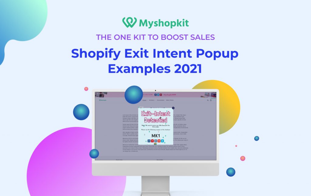
An exit intent popup is a lifesaver for Shopify e-commerce businesses that unluckily have a high bounce rate. The high bounce rate refers to the high percentage of visitors landing on one page of a website and then leaving without exploring any further. This definitely results in a low conversion rate.
To help address this issue, exit intent popups were invented to retain visitors who are going to exit the site. Exit intent popups are also among various attractive popups that MyShopKit offers for Shopify store owners.
However, not everyone can make the most out of this type of popup. Hence, in this article, I am going to introduce you to Shopify exit intent popup best practices, and examples so you can reduce the bounce rate and increase conversion.
But before that, let’s go over some fundamental knowledge about exit intent popups.
Shopify exit intent popups
Shopify exit intent popups are utilized in online stores to keep visitors who are about to leave. A visitor’s mouse movements are followed using an exit intent popup, and when the pointer passes outside the upper page border (since the tab bar is normally present), a popup window appears. A JavaScript snippet that monitors the speed and direction of the mouse is used to activate the ad.
A discount coupon is frequently included in the popup to persuade the customer to complete the purchase. Exit intent ads may also be used to provide a discount, encourage people to sign up for a demo, gather emails, or segment them into a newsletter list.
Exit intent plugin popup WordPress
Under the information economy, with the proliferation of the internet and digital media, communication and idea exchange have been moved to cyberspace. To be more specific, a lot of webs 2.0 were built to facilitate human activities in the Information Age. Some famous worldwide websites can be named such as Facebook, Wikipedia, Twitter, and web blog sites.
Among popular blog sites, WordPress is the most widely used. Hence, e-commerce businesses tend to do product promotion and marketing communications on WordPress. To keep visitors leaving the site without making any purchase, exit intent plugin popup WordPress is installed to grab visitors’ attention to provide a coupon or a sale off.
One highly recommended plugin popup WordPress is WooKit. It offers +200 aesthetic pre-built exit intent plugin designs for you to choose from. Its popup kit deals with so many goals such as collecting email addresses, getting social followers, and driving traffic to a landing page.
Exit intent popup best practices
1. Create a short and sweet Call to Action
Trying to cram too much information into your exit popup is one of the greatest mistakes you can make. The website visitor has already decided to quit your site since he or she is too busy to read your lengthy pitch.
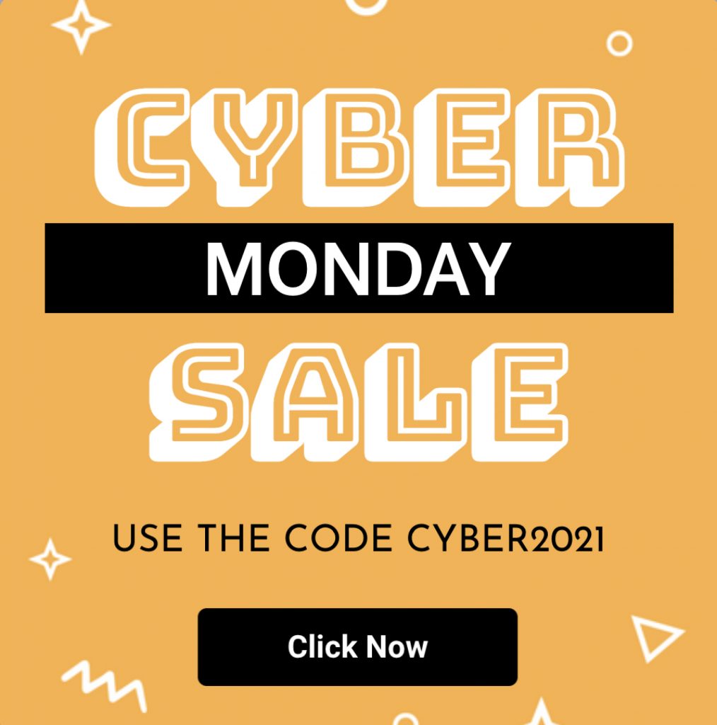
With only a sentence or two, go right to the point. Your call to action should be brief and provide a clear advantage to the visitor—for ideas, see this exit popup example.
2. Target a exit intent popup at the right visitors
Target marketing is of utmost importance to selling your products because you know the customers’ pain points and help them alleviate their pain points properly. For example, for visitors having a minimum budget and intending to leave your site, you offer them a 50% discount. They will be very pleased to drop their personal information on your exit intent popup.
For visitors who always long for modern and unusual products, you had better offer them exclusive products. For visitors leaving your site from a product page, they may be concerned about your shipping, return, as well as exchange policies. In that case, you can include risk-free online shopping policies (e.g. free shipping, 30-day return policy with full refunds, or exchange in stores.)
On the other hand, visitors might change their minds and take no interest in the product they browsed. Then, a Shopify exit intent popup should display the most relevant items in the same category.
3. Add gamification to your exit intent popup
You might also try an interactive option, such as the MyShopKit Win Wheel, instead of a standard-looking one. According to Omnisend statistics, this interactive solution increases the number of email subscribers, with a sign-up rate being 12.74 %. This figure is three times higher than a traditional email pop. People enjoy playing games!
4. Create a sense of urgency in your popup
One of the most effective strategies to raise your email sign-up rate is to create a sense of urgency. When your site visitors start to feel FOMO, they are more inclined to click on an exit intent popup.
Utilize the power of unique or exclusive offers wherever feasible to create a sense of urgency and encourage customers to subscribe. If you’re providing a 20% discount, for example, make it clear to viewers that they won’t be able to receive it again if they don’t take advantage of it now.
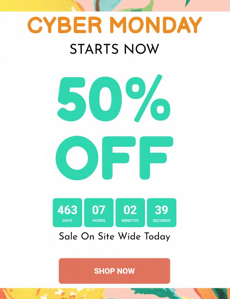
When it comes to generating urgency, a Countdown Timer popup of MyShopKit is a great choice. When the visitors see time’s running out, they will buy the item without hesitation.
Shopify exit intent popup examples
Please bear in mind that other brands’ popups below are partly edited by MyShopKit designers. We just keep the key message so that you can learn from them.
Shopify exit intent popup with short & sweet content
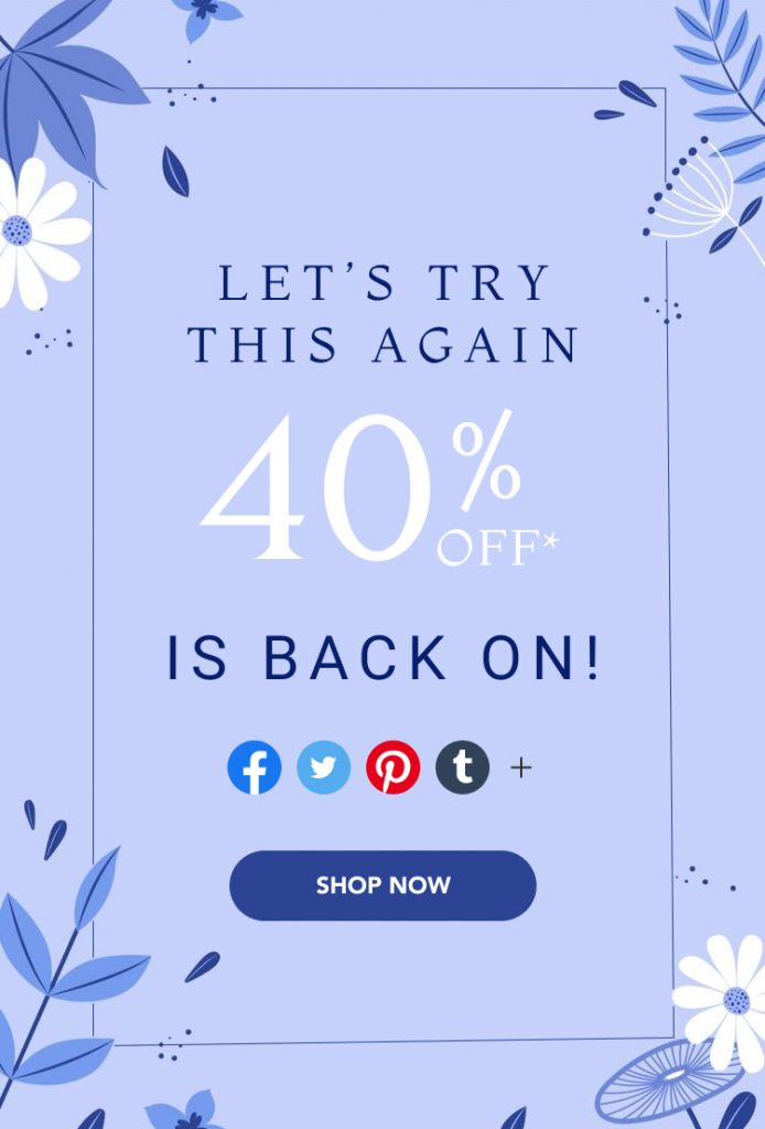
First purchase with 30% DISCOUNT in an extra size grabs visitors’ attention immediately. Plus, the message is to-the-point, which saves visitors’ reading time. Hence, the visitor won’t find the displayed popup annoying. Instead, they are willing to subscribe to modern styles. This popup is designed by the MyShopKit app.

BGBGeneration’s popup also uses the same tactic as the MyShopKit app. What’s more, it provides free worldwide shipping.
Shopify exit intent popup with product recommendations
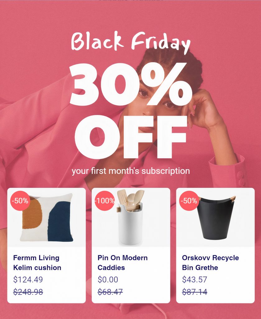
This email pop shows the idea of promoting particular products along with Black Friday 30% SALES OFF based on customers’ buying history or similar product search. The key benefit of these cross-sell/up-sell popups is that they are individualized, so a customer will be thankful and likely purchase something extra. Therefore, the Shopify store owners can use the opportunity to raise the average order value. This popup design also belongs to the MyShopKit app.
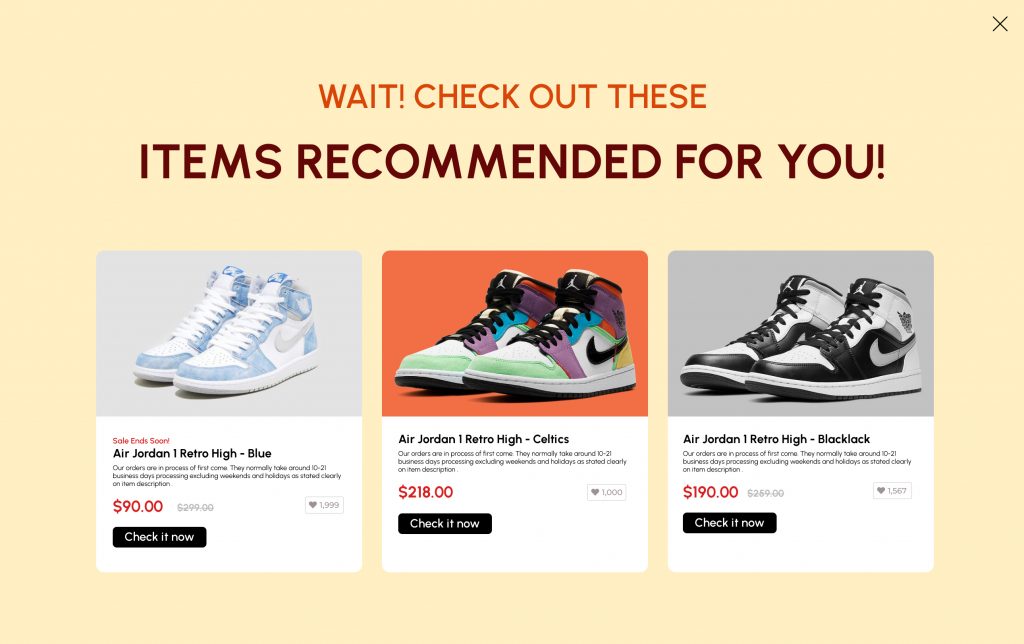
The popup of the ZooShoo store is also worth taking into consideration.
Bright Shopify exit intent popup
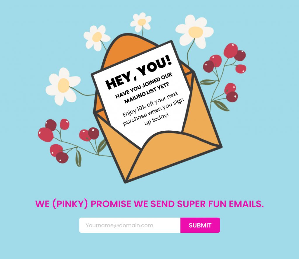
This colorful and eye-catching opt-in popup from Packed Party will show up to draw the attention of the customers who are about to leave the store. The phrase “Hey, you!” might surprise customers and entice them to continue purchasing.
Shopify exit intent popup to retrieve abandoned carts
Exit-intent popups are estimated to save 35% of customers, according to market figures. Reminding customers that they have anything left in their basket is one of the most effective methods. The Ugg internet shop handles it really well. Customers are encouraged to continue browsing and go to the checkout by an inconspicuous ‘oops.’ A cart popup like this is simple to implement in your Shopify business.
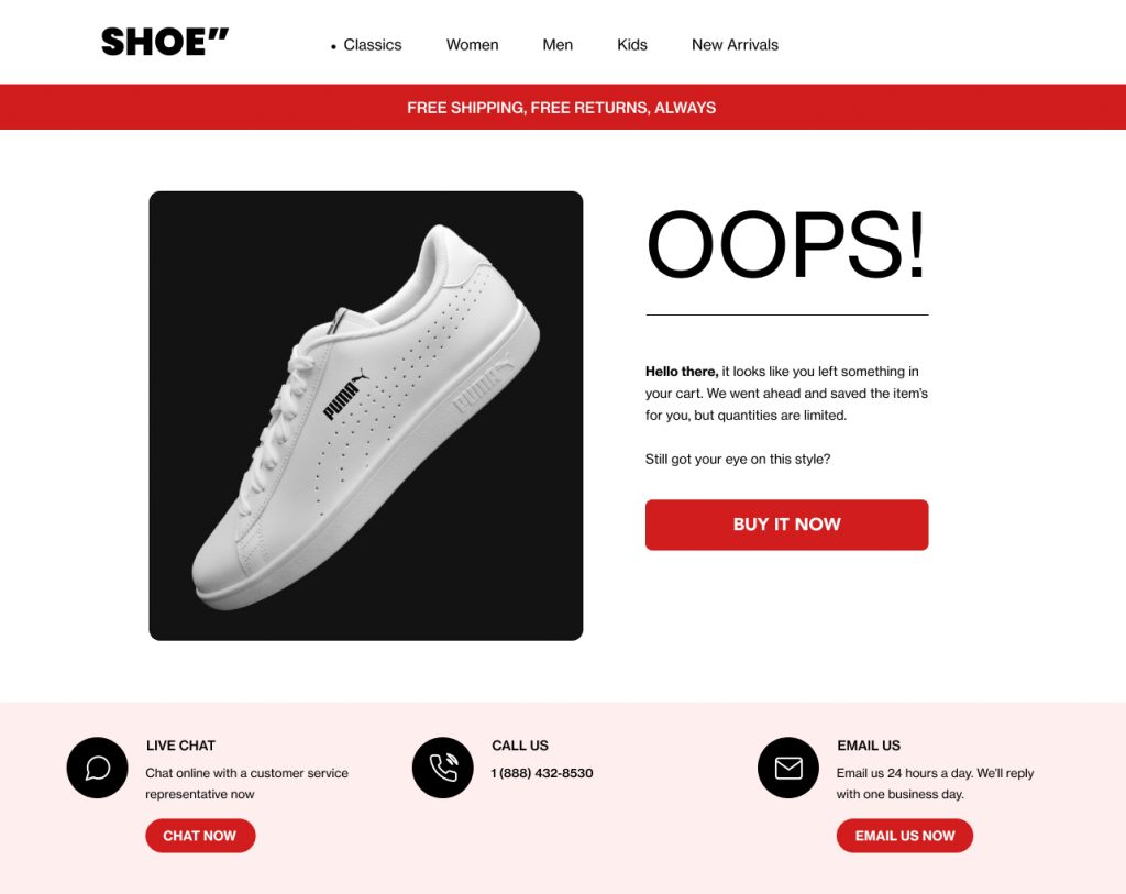
Another unusual example is from the Lord and Taylor shop. It prompts customers to recall things they may otherwise overlook. And, without a doubt, it motivates people to act and reduces cart abandonment.
Animated Shopify exit intent popup
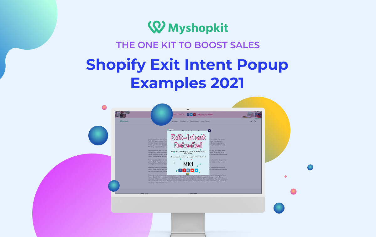
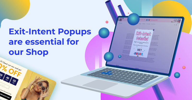
Compared to static popups, creating popups with animation will be more likely to make the visitors stop exiting the store. For example, MyShopKit’s popup below animates the phrase Exit-Intent Detected with changing colors as well as the coupon code. You can also add animation to the content to highlight your message.
Shopify exit intent popup to increase social follows with discount
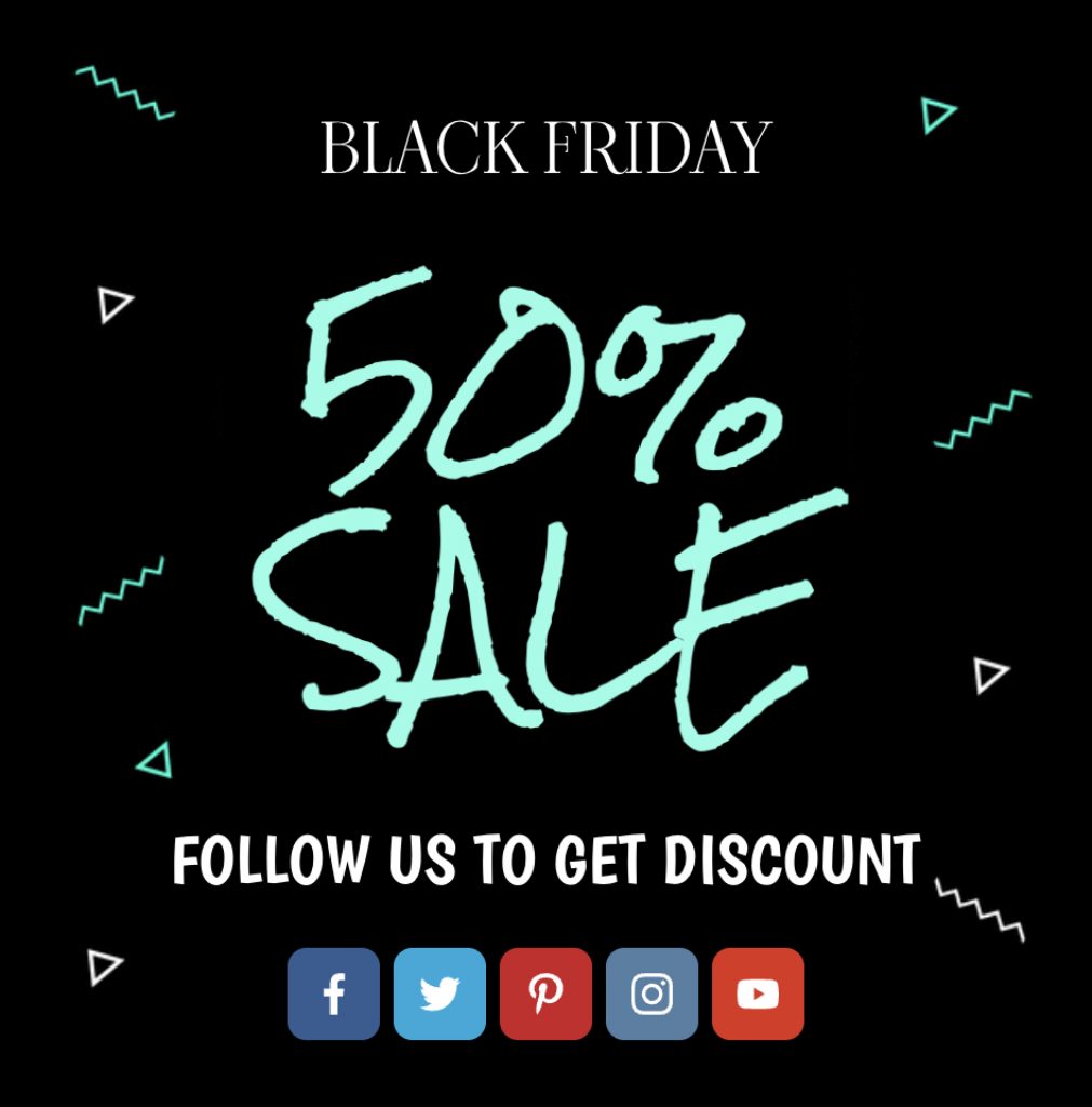
Inserting social media icons near the field “Get Discount Code” so the visitors can easily click on the icons and follow your shop on social media platforms. After that, if possible, you are encouraged to send a thank you message for signing up. Check out MyShopKit’s email pop!
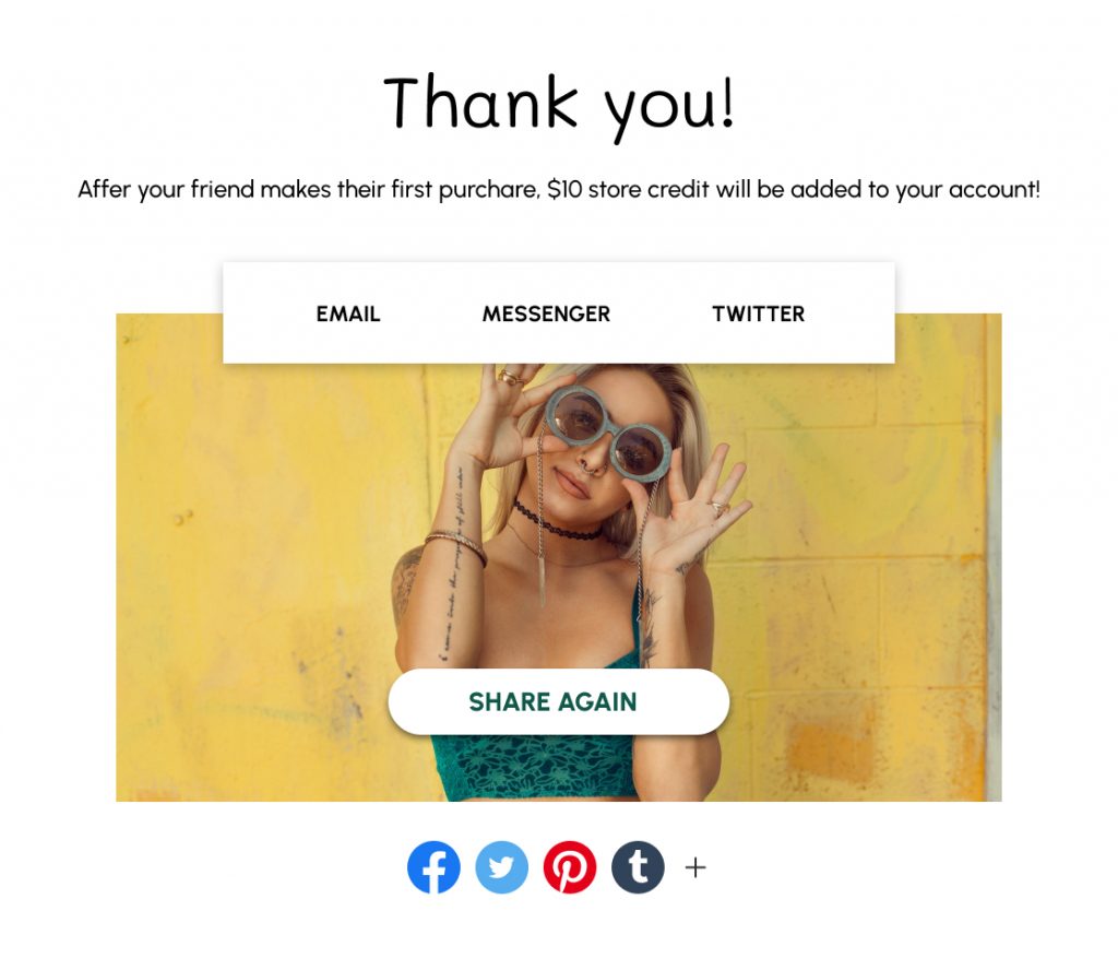
Or else, you can follow Glossier’s popup, which spurs customers to share anything about the store on social media. If their friends click on the link that purchasers post, Glossier will give them a $10 store credit. It’s a fantastic offer! Customers are encouraged to tell their friends about their purchasing experience, giving the brand an opportunity to expand the number of potential customers.
Shopify exit intent popup: Final words
Above are some Shopify exit intent popup best practices, and examples that are usually deployed by e-commerce businesses. Hope you can find the most appropriate popup design to integrate into your email marketing campaigns. If you are impressed with MyShopKit exit intent popup templates and want to find out more about them, please refer to Exit Intent Popup: Shopping Cart Abandonment Solutions. In there, you can have a sneak peek of what’s inside of the app. We have been attempting to make MyShopKit a part of the best exit intent popup builders on Shopify soon.
Take advantage of Shopify exit intent popups wisely.
Your conversion rate will rise rapidly.
Myshopkit
Exit intent popups: FAQs
Do exit intent popups work?
The answer is yes. Exit intent popups really work, especially for e-commerce businesses. A Shopify exit intent popup can help you reclaim 21% of your abandoned cart. Also, it is reported by Conversion Sciences that exit intent popups may be used to save 10 to 15% of lost visitors. Every e-commerce shop has a rate of cart abandonment of roughly 74.2%. You will almost certainly miss out on leads if you don’t use a Shopify exit intent popup.
How do exit intent popups work on mobile?
On mobile devices, exit-intent technology works differently than on a desktop. Because there is no mouse movement to detect, advanced exit intent popup software will display a popup when a visitor tries to shut the mobile browser tab or click “back.”
Do exit intent popups harm SEO?
Exit intent pop-ups are not subject to a Google penalty, according to Google’s John Mueller. He said:
“What we’re looking for is really interstitials that show up on the interaction between the search click and going through the page and seeing the content. So that’s kind of the place we’re looking for those interstitials. What you do afterward if someone clicks on stuff within your website or closes the tab or something like that then that’s kind of between you and the user.” – Google’s John Mueller
Watch the full video here

One Comment