If you’re looking to build a successful e-commerce business, one of the best places to start is by creating a store that sells groceries. There are many top Shopify grocery store examples out there, so it can be hard to know where to start.
In this article, we’ll take a look at some of the most successful Shopify grocery stores currently in operation. We’ll discuss their strategies, customer bases, and how they’ve managed to achieve such success.

What constitutes a successful Shopify store?
If you’re considering opening an eCommerce store, there are a few things you should keep in mind to set yourself up for success. First, you need to make sure you have a niche market and a unique selling proposition. You also need to create a strong branding strategy and build an engaged social media following. In addition, you’ll need to invest in search engine optimization and create compelling content to drive traffic to your store. Finally, check out the top 8 checklists below.
Knowing and understanding your customers
Getting to know your customers inside and out is essential to running a successful business. By understanding their needs, wants and pain points, you can give them the best possible experience – and keep them coming back for more.

Optimizing content for search engines and users
To ensure that your content is seen and used by as many people as possible, it’s important to optimize it for both search engines and users. This means using keywords and other strategies to make sure your content appears high in search results, and also that it is easy to read and engaging.
📚 You might like: Shopify SEO checklist you wish to know earlier (downloadable).
Design a professional website
Create a sleek, modern storefront that reflects the professionalism of your company, not stitched lines of code. Your Shopify store also needs to be enticing enough for customers to add products to their cart.
Building trust
Creating trust by providing a secure connection, a clear policy page, and easily accessible contact information. For Shopify clothing stores, you are advised to provide a size chart so customers can make a wise & suitable choice.
Making the purchase process quick and easy
Customers should be able to find what they’re looking for without any hassle, and checkout should be a breeze. By streamlining the purchasing process, we can make sure that our customers have a positive experience with us and continue to come back for more.

How do we improve the purchasing process? We’re working on three specific areas:
- Navigation and discoverability of products in our catalog.
- The purchasing flow, including checkout.
- The product detail page experience.
These three areas are the most critical to improving conversion rates on our site and we think that by focusing on these specific areas, we’ll see the greatest impact on our efforts.
Authentication
Reviews, comments, and testimonials are used to authenticate a product or service by showing that it is trustworthy and reliable. If there are no reviews on the product or service, then it seems unreliable.
Creating a sense of urgency
Convincing the customer that if they don’t buy immediately, they’ll miss out on a fantastic opportunity. You can do so by attaching product badges on the product photo like Low Stock, Hot Sale, Trending Now, Best-Seller, etc.
Upselling
By offering a buy one get one free deal, as well as free shipping, you can encourage customers to purchase more items and boost sales. Selling is an art and it takes some serious skill to master. If you want to be a great salesperson, start by using the above tips and tricks.
Shopify grocery store examples
The list of the following Shopify stores includes different types of consumer products. That said, most of them sell food and beverages.
Veda Grocery Demo Stores
If you’re on the lookout for inspiration for your grocery store, you’ve come to the right place. We’ve handpicked a selection of exceptional Shopify grocery store examples, all highlighting the capabilities of Veda Builder, an all-in-one Shopify website builder.
Conversion Rate Optimization (CRO) Features Include:
- Mega Menu: Facilitate easy navigation through your grocery store.
- Services: Offer convenience with services like free shipping, easy returns, and quality guarantees.
- Food Menu Card: Simplify meal planning with detailed recipes, ingredients, and nutritional information.
- Buy in Bundle, Buy Combo, and Buy More to Save More: Encourage bulk purchases with enticing discounts.
- Large Banners and Product Images: Showcase the freshness and variety of your products.
- Related Collections: Cross-sell by guiding customers to complementary products.
- Parallax Images: Engage customers with dynamic product visuals.
- Customer Reviews: Build trust with product reviews and ratings.
- Sticky Add to Cart: Prevent cart abandonment with a persistent ‘Add to Cart’ button.
- Mini Cart Drawer: Streamline the shopping process with a convenient mini cart.
These grocery stores have taken the concept of online shopping to the next level, ensuring that customers enjoy a seamless and engaging shopping experience.
Visit Real-Life Demo Stores
To fully grasp the power of these CRO features, visit our real-life demo grocery stores. Experience firsthand the seamless and engaging shopping journey these stores provide to their customers.
- Veda Food Store Homepage (Password: 1)
- Veda Food Store Product Page (Password: 1)
- Veda Drink Store Homepage (Password: 1)
- Veda Drink Store Product Page (Password: 1)
Discover More Demo Stores
In addition to our featured grocery and home decor stores, you can also explore other demo stores to expand your understanding of the possibilities available for your grocery and home decor e-commerce venture.
Try Veda Builder for FREE
Ready to take your grocery store to new heights? Give Veda Builder a try – for FREE! Your journey toward a successful grocery store begins here.
Ratio Coffee
Upon entering the store, customers are immediately greeted with a large popup advertisement offering a discount on their purchase.
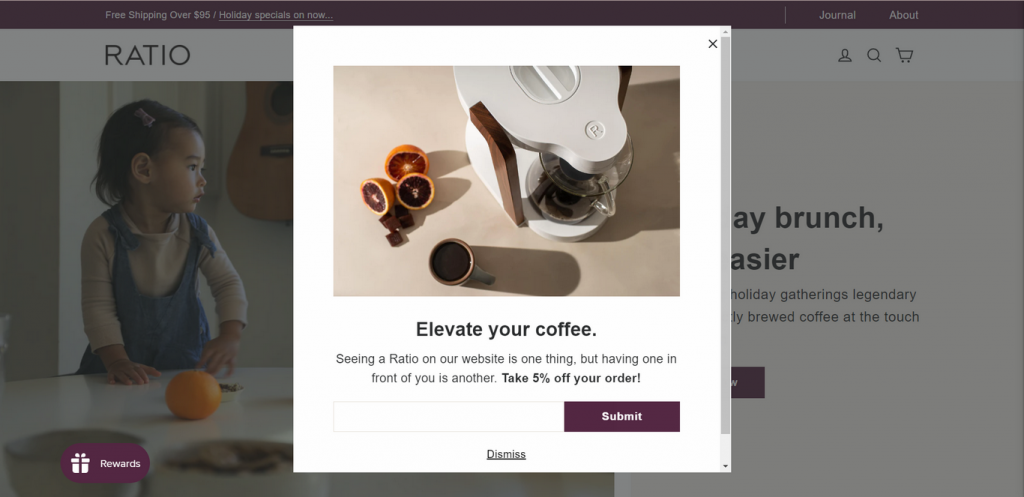
The elegant style of this Shopify site is embodied by its well-balanced color scheme and easy-scrolling interface. Visitors are drawn to Ratio Coffee by the simple CTA button, attractive slogans, and rich images with text. The humorous and entertaining content on their website also attracts interested customers to their shop.
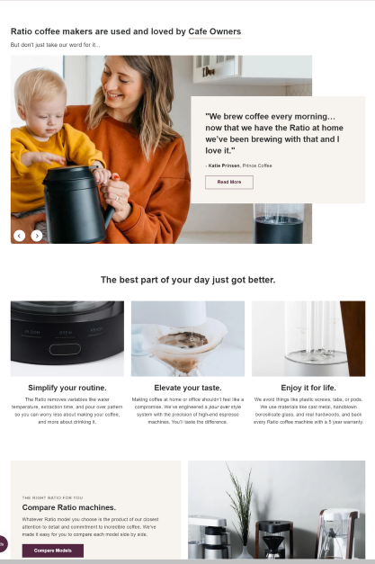
There is a testimonial slideshow designed to convince customers of the benefits of using our products. The slideshow features glowing reviews from satisfied customers, highlighting how our products have made their lives easier.
OLIPOP
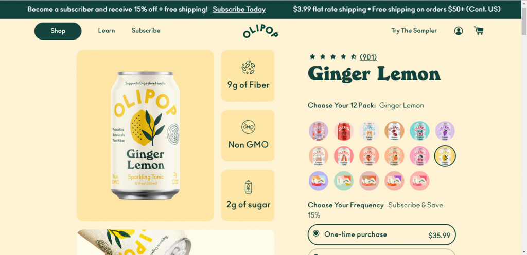
The concept behind OLIPOP is to introduce a new soda that has a modest sugar content but is abundant in dietary fiber to help your gut microbiota.
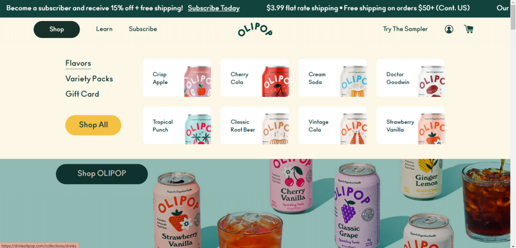
The store has a clean, vibrant, and inviting atmosphere. With the Pop in the Press section, it provides social proof to effectively illustrate the soda’s benefits and credit. Additionally, the product page has a unique design and changes color according to the selected taste. How amazing it is!
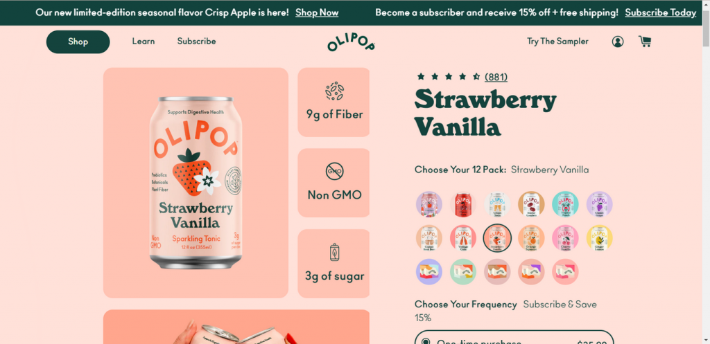
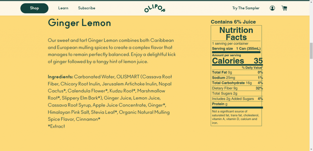
Another thing that is well-worth mentioning is the nutrition facts just below the product. This brings authentication to the product and reassurance to consumers. Just by looking at the store design, I can’t resist the urge to buy a soda for myself.
Guelaguetza
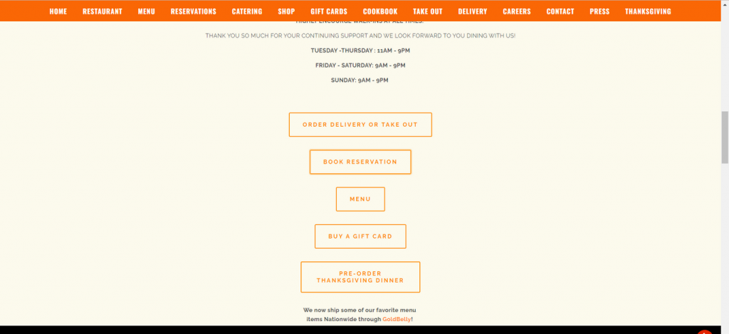
Mole is a well-known sauce often used in Mexican food. Guelaguetza honors these flavorful origins with a vibrant website that packs a punch. Each and every product image is of a high standard and leaves a lasting impact on the buyer.
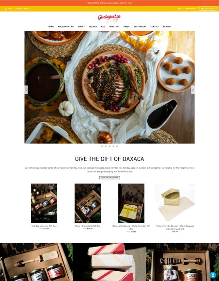
It’s hard to resist wanting to get a mole starter when the webpage bombards you with images of mouthwatering foods, straightforward instructions, and the components.
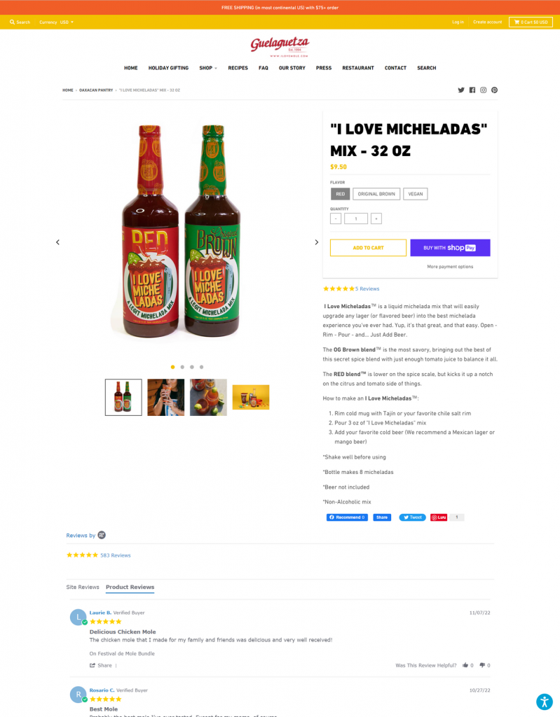
Beneath every product is a customer review to give honest feedback about the item. Also, there is a beautiful area devoted to their restaurant, complete with a menu and a reservation option.
Teatox Australia
Teatox Australia is a one-product shop established in 2013 to assist individuals in losing weight naturally using tea detoxifying programs.
The site maintains a clutter-free layout while displaying photographs of excellent quality & color. What I like about this store is the review section that rotates automatically. Also, it educates customers well by giving free ebooks and informative blog posts. The blog area is also cleanly structured and has eye-catching graphics.
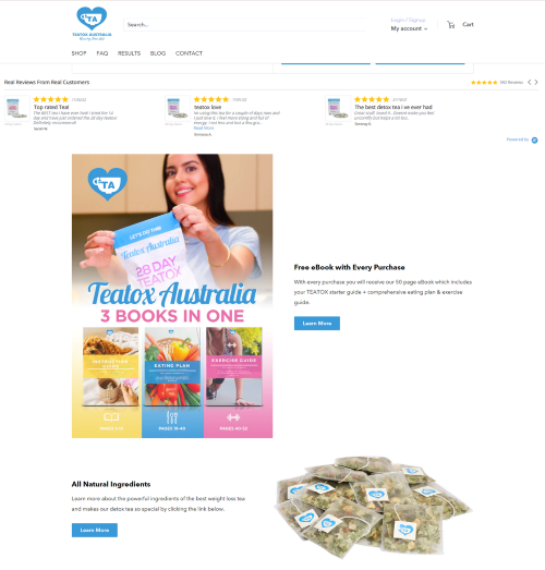
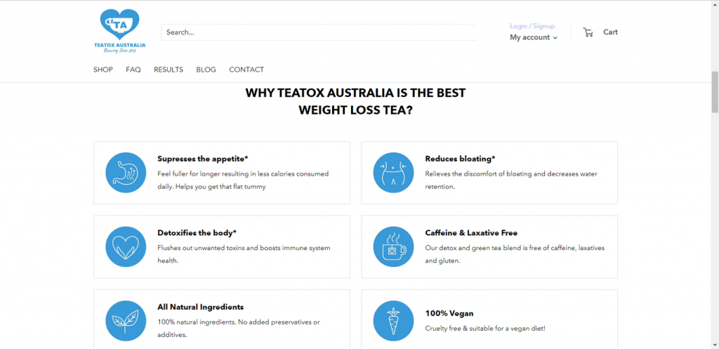
Their tea helps people lose weight, and the webpage describes how its ingredients do this. Additionally, there are other package options available to upsell products.
Death Wish Coffee
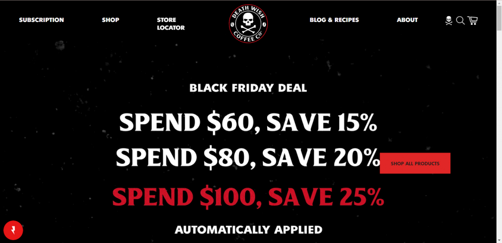
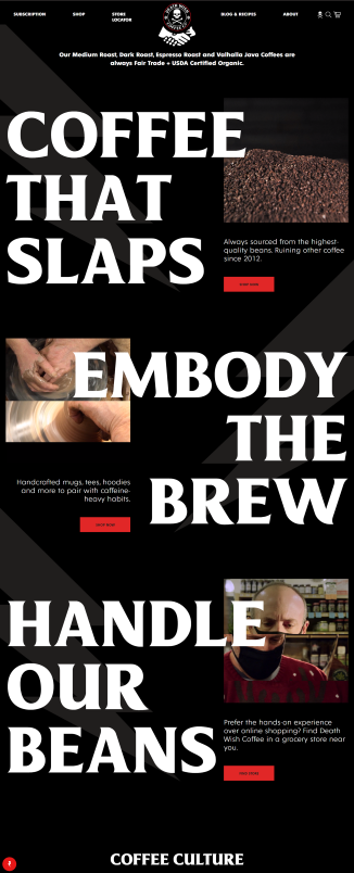
The inky black color reflects Death Wish Coffee’s main product – coffee. The background is a lively animation with a homepage banner showing a discount in large, bold text. The main body of its homepage makes me think of a vast, eye-catching billboard featuring a moving video that tells an inspirational story.
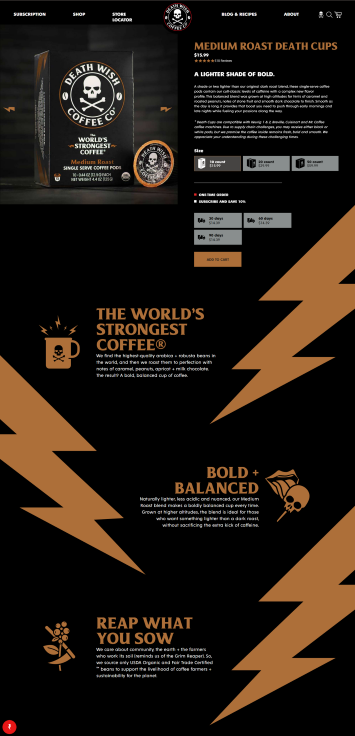
The product page is designed to give visitors a sense of the coffee’s strength at a glance. To do this, they’ve used lightning bolt icons to show just how strong each coffee is. Below, you’ll find a section on how they make coffee while protecting ecosystems.
Huel
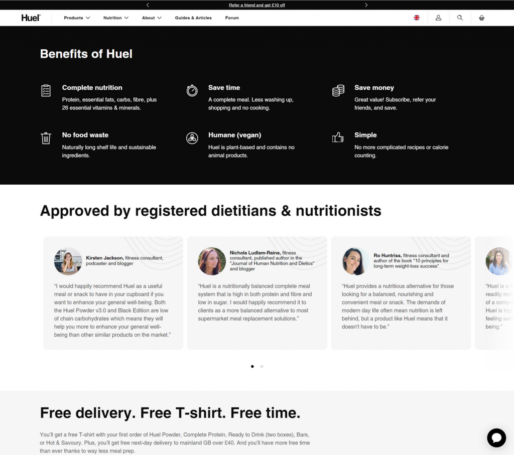
The simplistic and modern design of the store shows me that their products are wholesome. I have to say that Huel takes advantage of upselling very well by selling products in a bundle. Also, the bottom banner encourages customers to sign up and buy more.
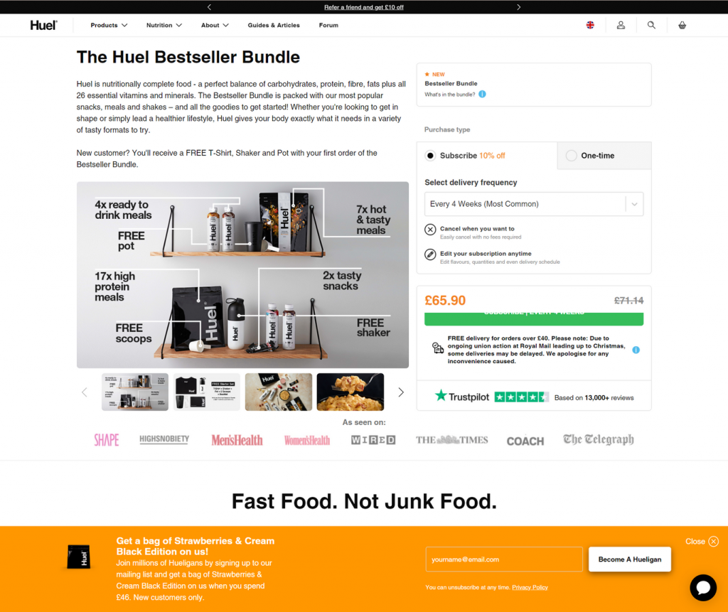
Below the product image is a list of well-known presses mentioning Huel’s products. What impressed me most is how detailed it is when it comes to illustrating how complete protein is in products.
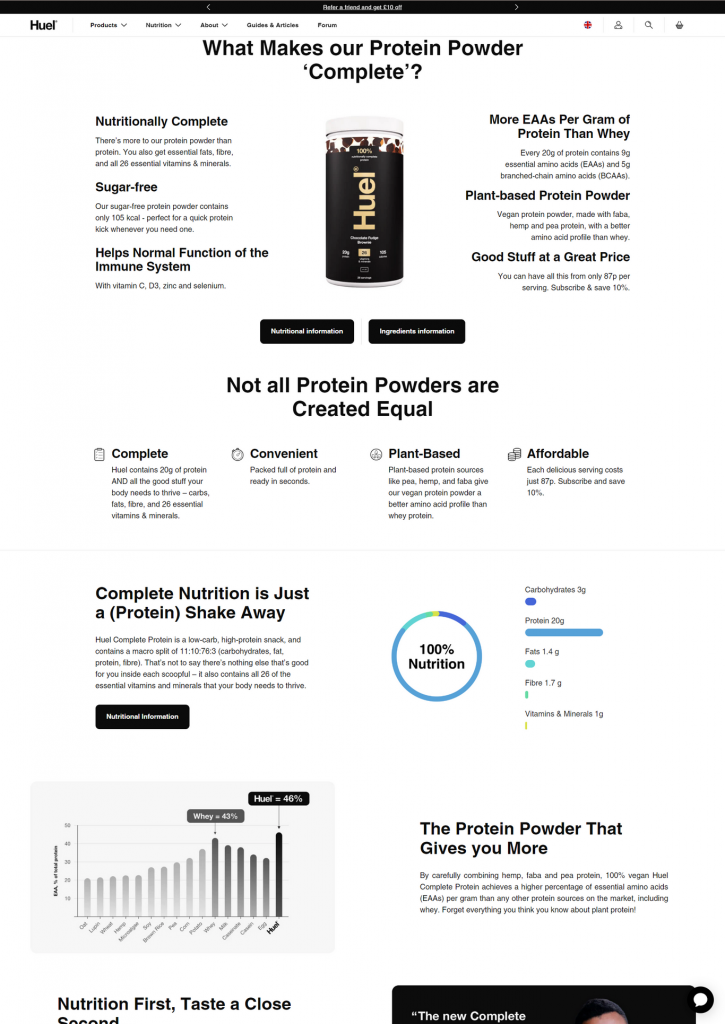
There is a Benefits section that discusses how Huel products can help improve one’s quality of life. And, Huel also quotes famous dietitians & nutritionists to offer social proof.
Knack
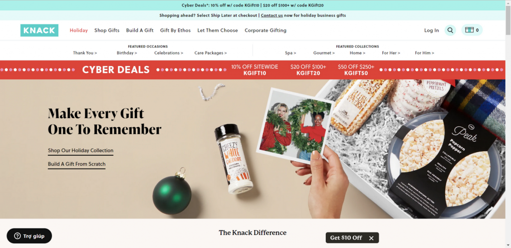
You don’t have a knack for giving gifts? Knack – modern gift giving – comes in to give you a hand. The upsell is the one aspect this Shopify store is aiming for. The whole goal of the business is to stuff a lovely gift box with unique treats. When shopping in Knack, you can overspend without knowing it. It’s very skillful at selling in a combo.
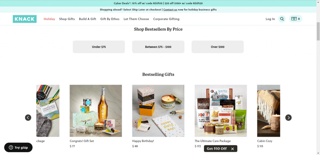
There is a section dedicated to Instagram pictures to show customers’ pictures while driving them to become followers.
Shopify grocery store examples: Final words
In conclusion, there are many different grocery stores that you can use as a template for your own eCommerce store. Each has its own strengths and weaknesses, so it is important to carefully study the top shops before starting your own venture. However, with careful planning and execution, any store can be successful. So what are you waiting for? Start your own top shop today!
